


Reworking and improving the UX & and UI of the Internal Creative Tool for Scape.

SCAPE (Ringtail Interactive)

1 year

Dec 2023 - Dec 2024

Role: UX/UI Designer
CONTEXT
The Creation Toolbox needed a redesign to improve the User Experience and establish a cohesive Visual Design. I took full ownership of both the UX and UI.
My responsibilities included creating a scalable design system with components, text styles, and color styles, onboarding developers, and improving the hand-off process. I worked closely with Game and Tech Designers, and conducted competitive research and analysis to validate design decisions.
HOW MIGHT WE
BACKGROUND
Creation Toolbox - Whats that? 🎮
The creative tool is designed to ease the process of making games and experiences as a player. Our goal was to create an intuitive tool that anyone can start using immediately. It's essentially a 'mini-game creator,' inspired by Roblox Studio, Unreal Engine for Fortnite, and Unity.
DISCOVERY
Identified isues with the original design
No consistency
There was no consistency in the design. The spacing between elements varied, as did the font sizes, with no clear pattern or logic applied.

Lack of visual hierarchy
There was information overload across multiple screens due to a lack of visual hierarchy, making it difficult for users to absorb information in the correct order.
Bad navigation
There was a lack of proper navigation and userflows.
Wrong Software
Much of the old design was created in Illustrator, which made it difficult to track updates and access all the files.
Low UX maturity
There was no established process for handing off designs to developers, and the team's low UX maturity meant limited familiarity with Figma among the developers.
No UI Design
When I took over the project, no UI design had been applied or developed.


PROBLEM - MAIN SCREEN
Cramped UI, inconsistent spacing, and poor design
This is what the Main Screen, also known as the Home Tab of the creation toolbox, looked like before I took over. I had to improve the UX while considering all the existing functionality and features.
[OLD] ORIGINAL DESIGN (NOT MY WORK)
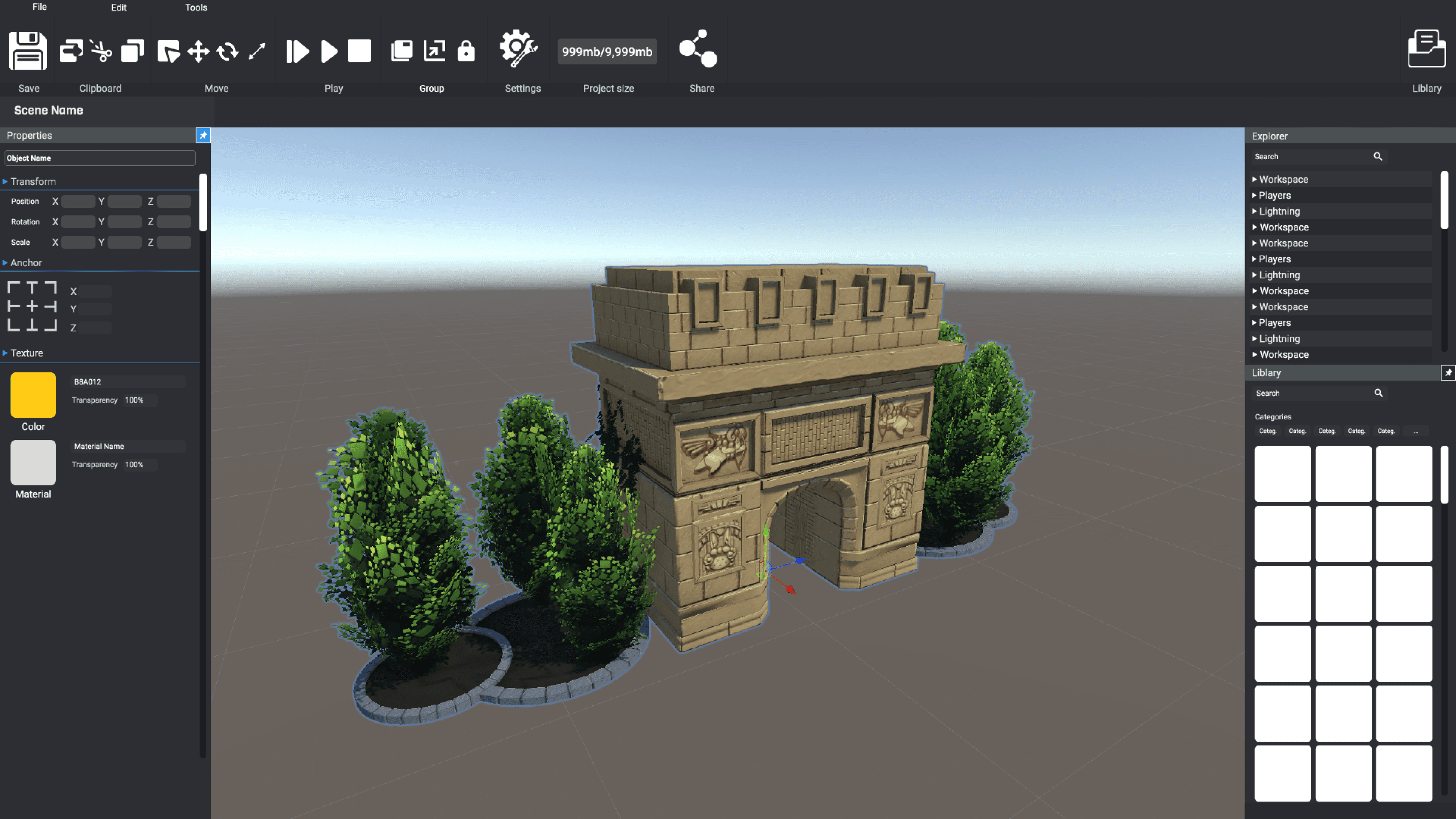
[OLD] ORIGINAL DESIGN (NOT MY WORK)


Potential Impact
In the original design, all functionality was placed in the same area - the navbar.
There was no strategic thinking about where each feature should go or what made sense. As a result, the navbar quickly became overcrowded.
What happens when more features are added in the future?
THE RESULT
MAIN VIEW REWORK
Updated Design for the Main View aka "Home Tab"
✔️
Navbar Improvements
By adding a Top Bar on top of the navbar it made it easier to group information and create a clearer navigation for our users.
✔️
Better Grouping
Information that belongs together are now grouped together.
✔️
New Library
The new Library Design has an improved scalable design with categories and tags.
✔️
Improved Properties Panel
In the old design, material & color were placed in the navbar, they are now moved onto the properties panel.
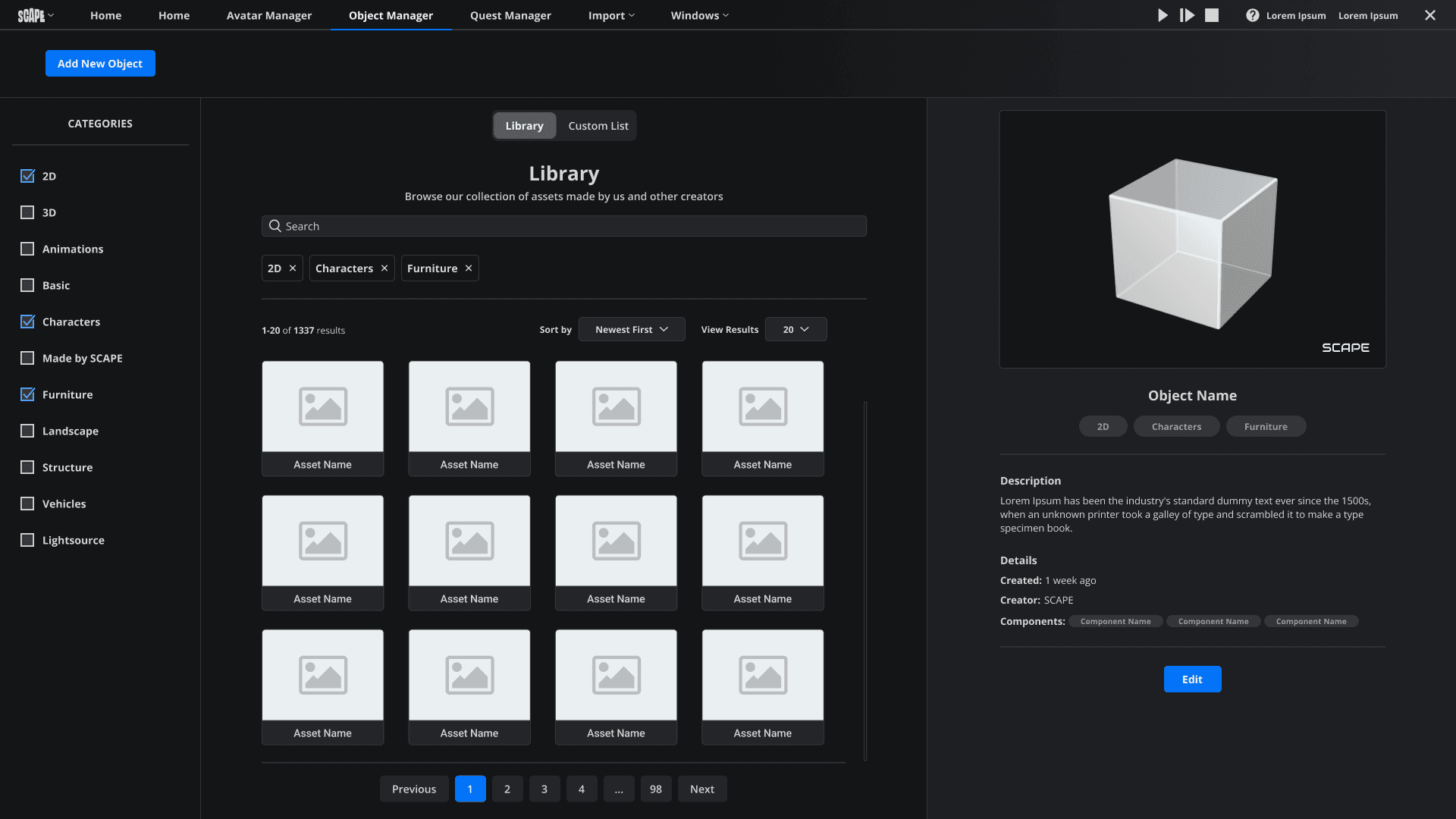
PROBLEM - OBJECT MANAGER
Lack of Visual Hierarchy, confusing layout, and an overall messy design
Now, moving on to the Object Manager tab, this is where users will import assets for their experiences as well as upload their own. The main goal is that this will be community driven where users can share their creations of assets with other people.
Here's what the original design looked like.
[OLD] ORIGINAL DESIGN (NOT MY WORK)
🤔
Information Overload - Showing too many items at once
Looking at the screen for the first time my eyes went all over the place. Not only is it presenting too many elements all at once, its doing so in multiple places.
According to the Paradox Of Choice Principle, its crucial to reduce complexity by providing users clear and concise options. This design is doing the opposite of that which is resulting in Information Overload.
❓
Lack of Visual Hierarchy
I didn't know where to begin looking, and I felt confused by the layout. One section used horizontal scrolling, while the other used vertical.
Additionally, there was no pagination, only infinite scroll, which could be problematic in our use case, where we might need to display thousands of items to users.
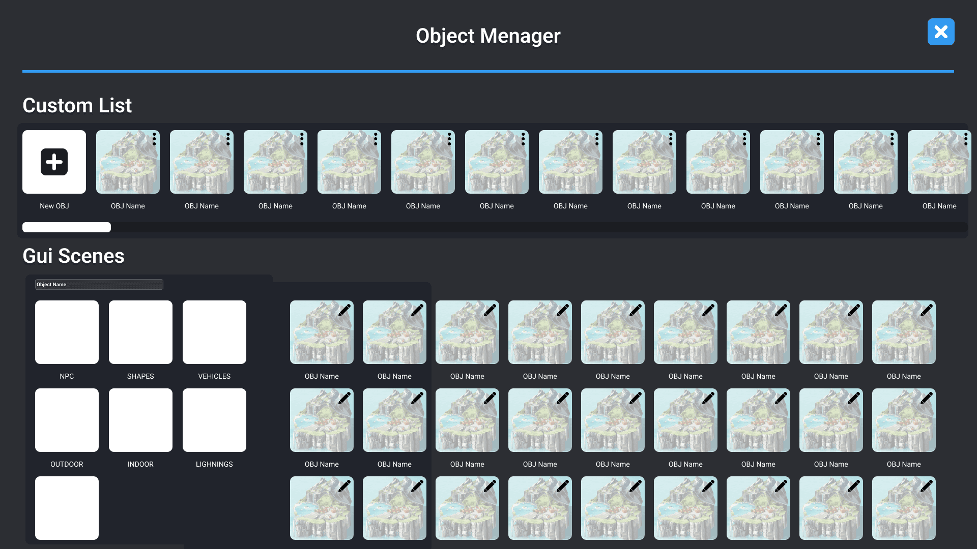
THE RESULT
OBJECT MANAGER REWORK
New Object Manager Design
✔️
3 Sections
By dividing the design into three sections, we are able to present big amounts of information in a tangible way.
✔️
Pagination
Pagination or Infinity scroll can be a challenge to choose between. However, for our usecase where we might show 1000+ objects for our users; pagination made the most sense.
I added the option for our users where they can choose the amount of objects to show in the result list, that way they can scroll through as many results as possible without feeling limited by the pagination.
✔️
Dynamic Visual Feedback
When the user clicks on an object they get an instant preview of the object with details regarding it.
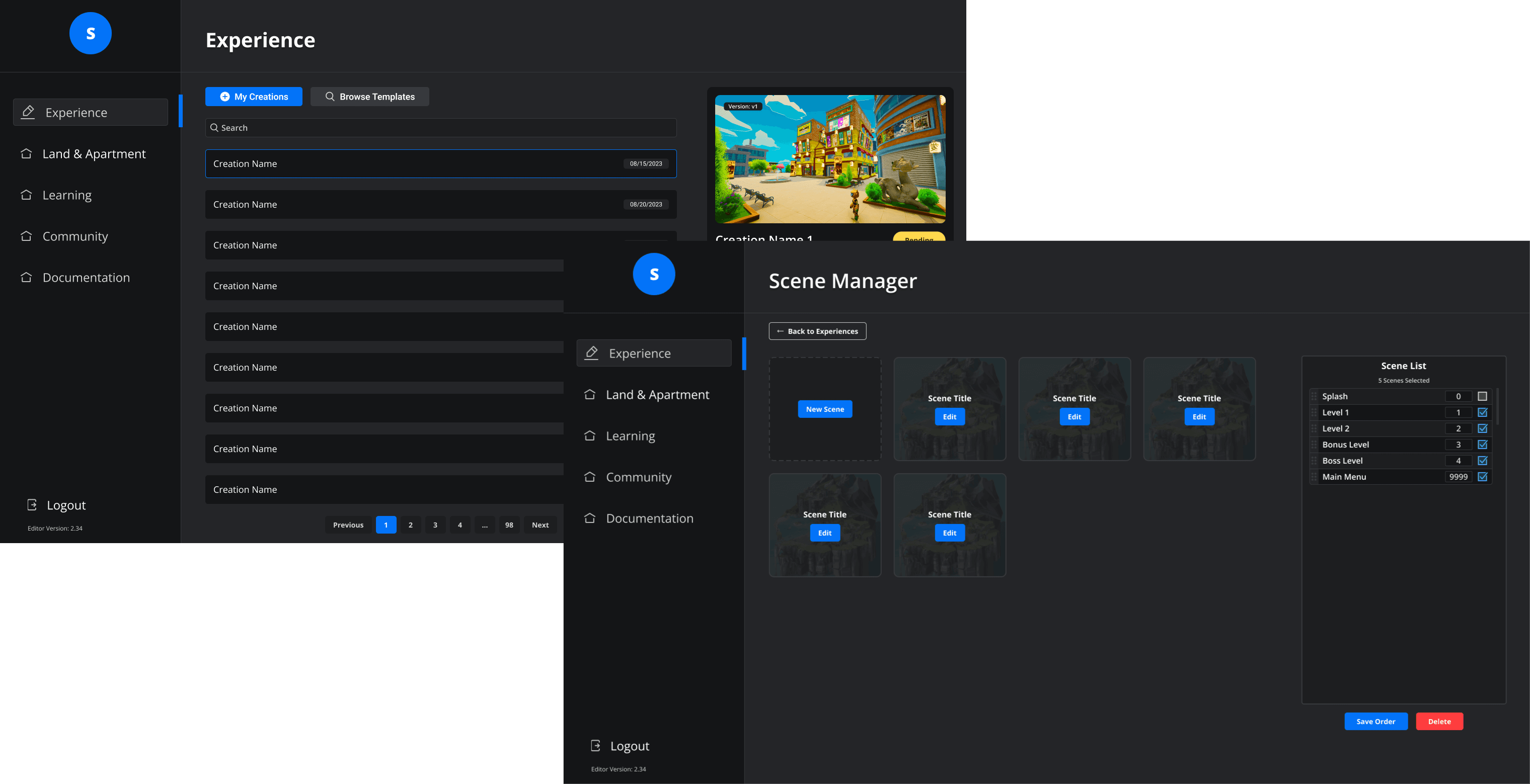
PROBLEM - LANDING PAGE & SCENE MANAGER
Bad readability and cluttered design
This is what the Landing Page and Scene Manager looked like before I took over. Its within the Landing Page where our Users will boot up their existing Game / Experience or create a new one.
Once again, there were issues with a cluttered design due to an unclear visual hierarchy. Additionally, we had a lot of information to provide to the user, but in these designs, it was not presented in a user-friendly manner.
[OLD] ORIGINAL DESIGN (NOT MY WORK)
[OLD] ORIGINAL DESIGN (NOT MY WORK)

THE RESULT
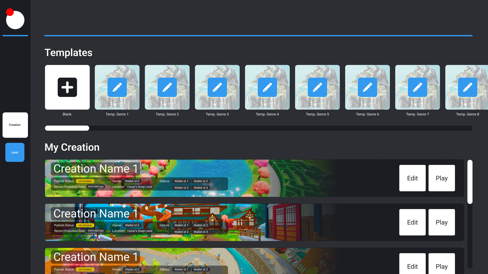
LANDING PAGE REWORK
New Landing Page Design
✔️
Tabs
I added tabs for our users creations and templates so they can navigate themselves easier.
✔️
More Sections
Instead of having the Creation Title + Information + CTAs in one place I divided it into two seperated sections.
SCENE MANAGER REWORK
New Scene Manager Design
✔️
Removed Horizontal Scrolling
I instead went for a list format and if more scenes were to be added, pagination or infinity scroll would be used.
DESIGN SYSTEM
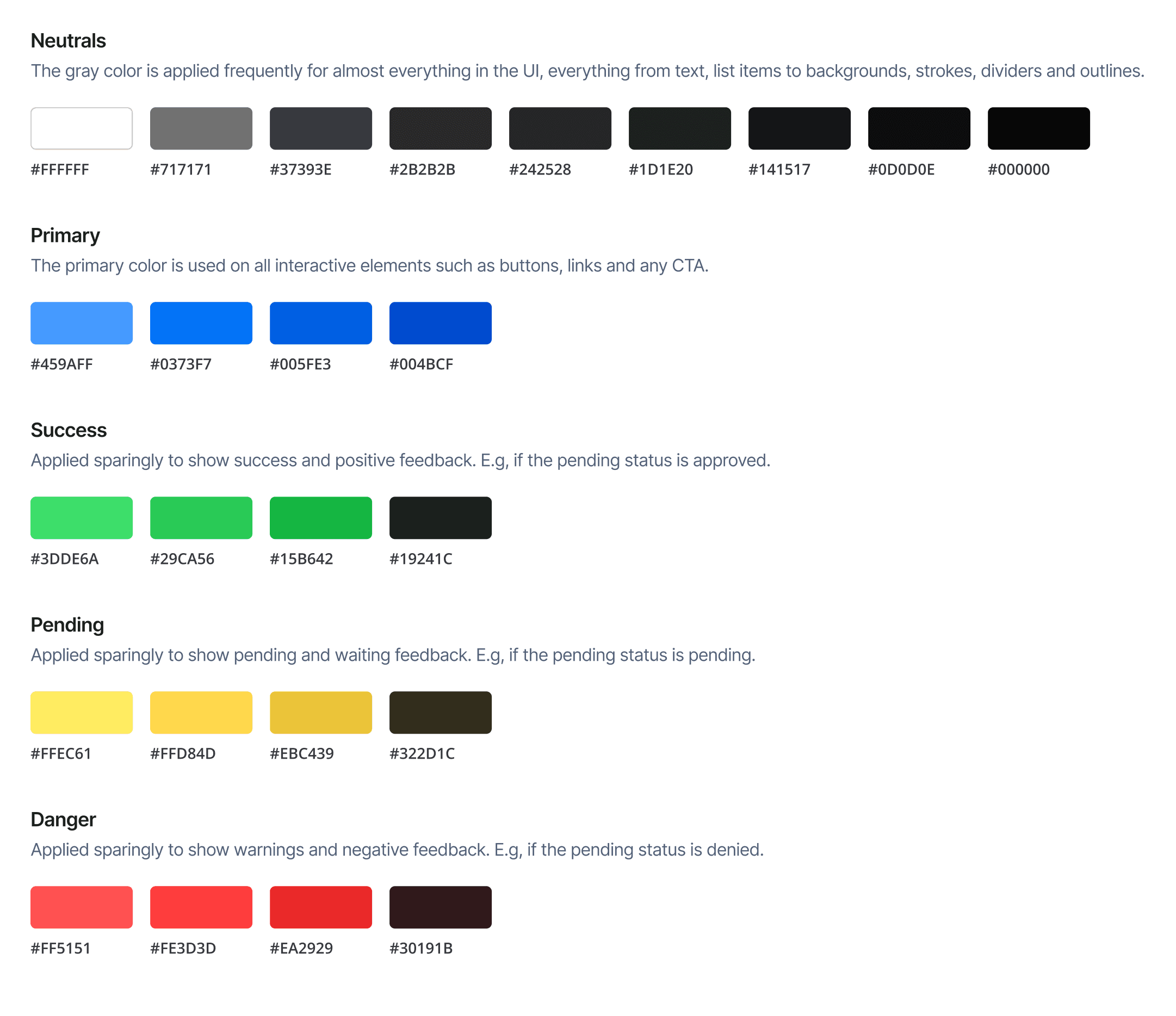
Color Styles
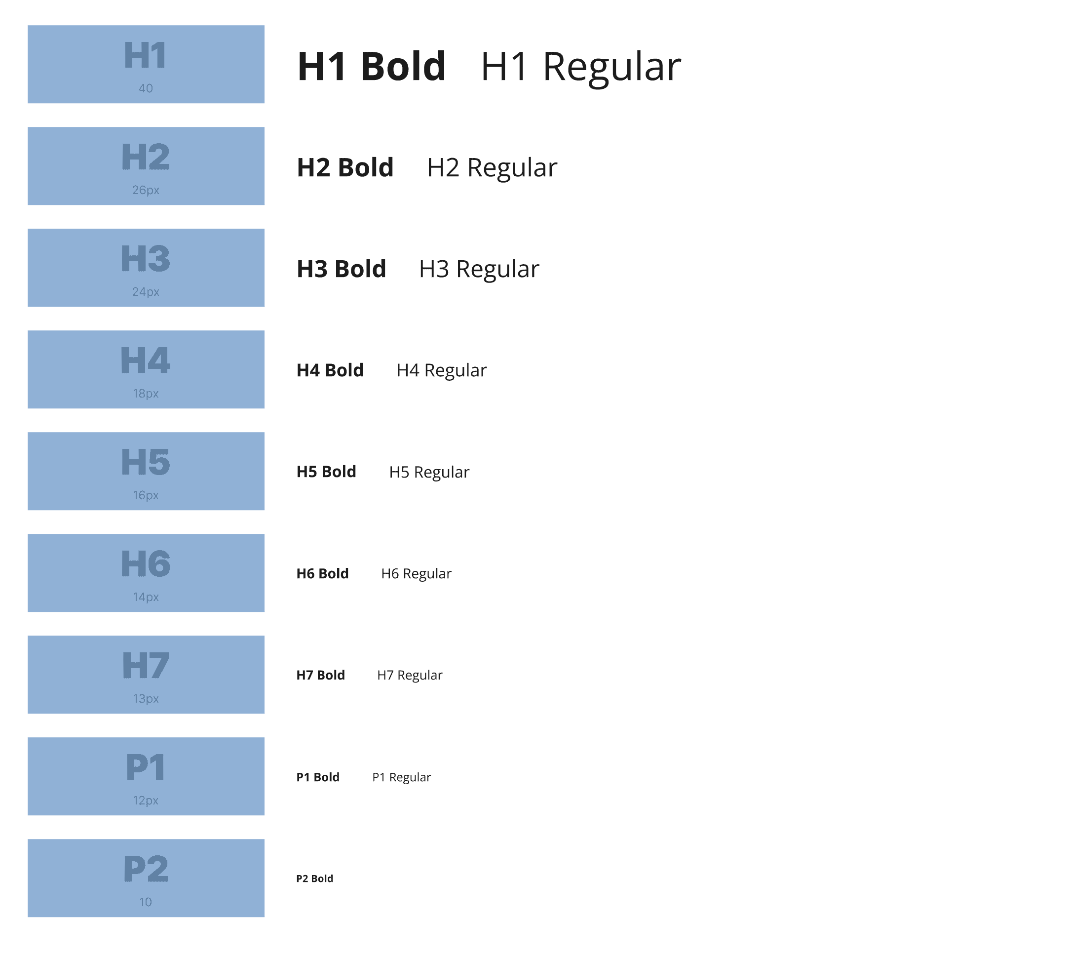
Typography
Example of the Component System

Power of 8 Grid System
To keep the design consistent throughout all components and layouts I use the 8pt Grid System.

thanks for visiting
SARA - 2025 - STOCKHOLM