https://www.geoguessr.com/
GeoGuessr
GeoGuessr is a Geography Game played on the web or their app. I was assigned with improving the User Experience through the UI and pinpointed that the current overall layout felt cluttered and overwhelming.
I reworked the Location Feedback Screen and the Result Screen to improve visual hierachy and upgraded the visual design to fit a gaming-theme.
Role
Visual Design, Animation, UX
Problem
There is no visual hierarchy and the design feels cluttered and overwhelming
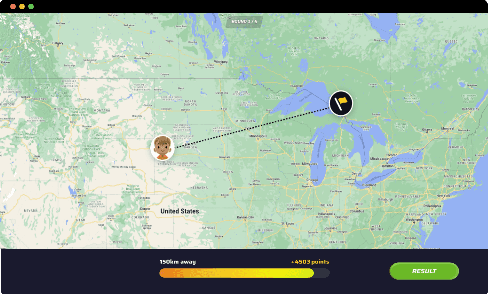
When a user place a guess they are prompted with the Location Feedback Screen. Here they are presented with lots of information to take in.
01
Lack of Visual Hierarchy - Is the User suppose to look at the Big Green Button in the middle? The Big Blue numbers? Or the Big Red numbers?
02
Redundant Information - Text that is needed to explain other text or icons becomes redundant. When this happens, it usually means the icons or text aren’t clear enough for users. In this screen, the design explains the distance and score with additional text because it’s not visually clear on its own.
03
Static Map - There is no animation to the map or the line when a user has placed their guess. Animations can help create a feeling of immersion while also being a great tool to visually guide users.
How might we improve the user experience through animations and a new UI?
Context
Fixing What’s Broken
Improvements

Clear Visual Hierarchy - The user can follow the animation of the bar loading to visually see how far or close their guess was.
Information that belongs together are now grouped together, the result button is therefore placed to the side to divide the information in a clear way that is easier to digest.
I am also working with color theory to further guide the user in the loading bar. The closer their guess - the greener. The further away - the more red.
No more redundant information - No more text to explain other text.
Animated map - To create immersion the user can see the distance animation, it also moves in the same speed as the bar loading.
Few Elements - Even though this improvement is showcasing the exact same data as the old design, it is divided and visually presented in such a way that it comes across as less.
BEFORE
AFTER
Problem
Unclear Icons and too many elements fighting for the same attention
When a user has finished a match they are prompted with Summary Feedback Screen.
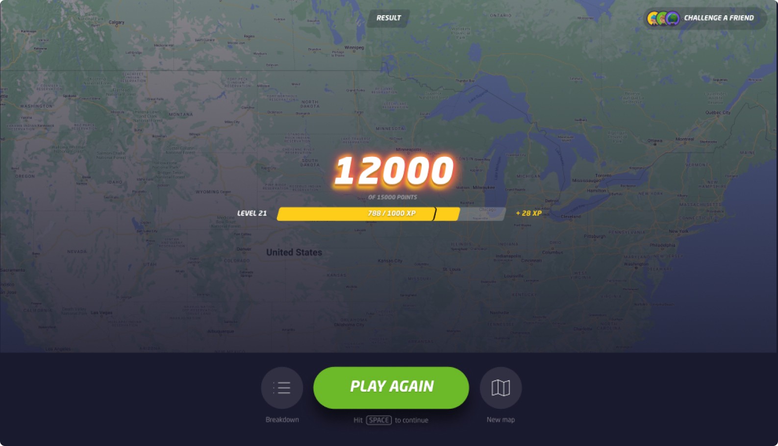
Issues
01
Redundant Information - As the previous screen there is yet again text to further explain other text or icons becomes redundant. The breakdown icon is also very unclear.
02
Too many elements - Similar to the previous screen, there are numerous elements to process here:
Current Points
Total Possible Points
Your Level
XP Needed to Level Up
XP Gained this round
Round performance breakdown
Call-to-action and map selection options.
This layout is overly cluttered and could benefit feom a cleaner structure.
Context
Fixing What’s Broken
I split up the information into two screens.
Improvements
Celebration Screen - There is now a dedicated results screen featuring celebratory animations. This design provides users with immediate feedback on their points while enhancing the sense of accomplishment. As soon as a match concludes, users are presented with this view.
Summary Screen - After the user has finished the celebration screen they are prompted with the match summary screen.
Avatar Added - To create a more engaging and playful design, I decided to feature user avatars on this screen. This approach fosters a stronger connection between users and their character. The updated visual design is tailored to appeal to gamers, aligning with the common match summary style seen in video games.
From a monetization perspective, prominently displaying avatars can encourage users to invest in accessories and clothing, as they’ll see their customized avatars showcased more frequently.
Clear Visual Hierarchy - The previous icons for Breakdown and Map Change were unclear. I decided to remove them entirely and replace them with text buttons instead.
These buttons are now placed in a more logical context, directly aligned with the relevant information, making navigation clearer and more intuitive.